Color is emotional. It bypasses the reason and goes straight for the gut. It is common to put together an outfit out of mostly neutrals with a pop of color, or one primary and one secondary color, but we enjoy more unexpected color combinations. A bold and thoughtful color palette can update vintage items and inject a sense of personal style into your look.
When it comes to color, choose your palette and commit!
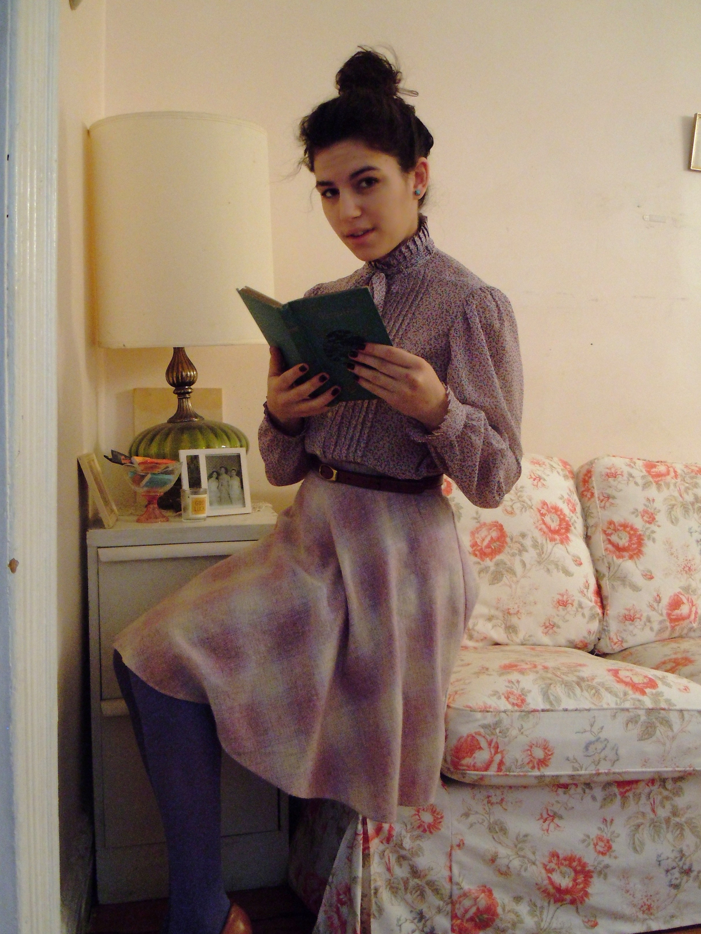
Nicole commits to lavender floral blouse and lavender plaid skirt. Complimentary colors: cream, light brown, periwinkle, rose
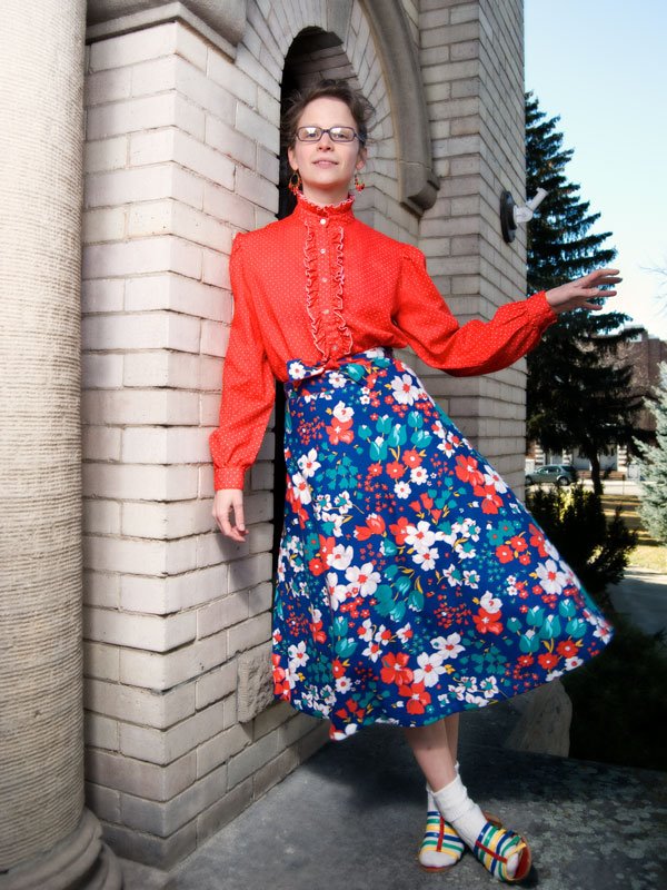
Kelly commits to red and white polka dot ruffled blouse and red, blue, and white floral skirt (both vintage 70s). Complimentary Colors: teal, yellow
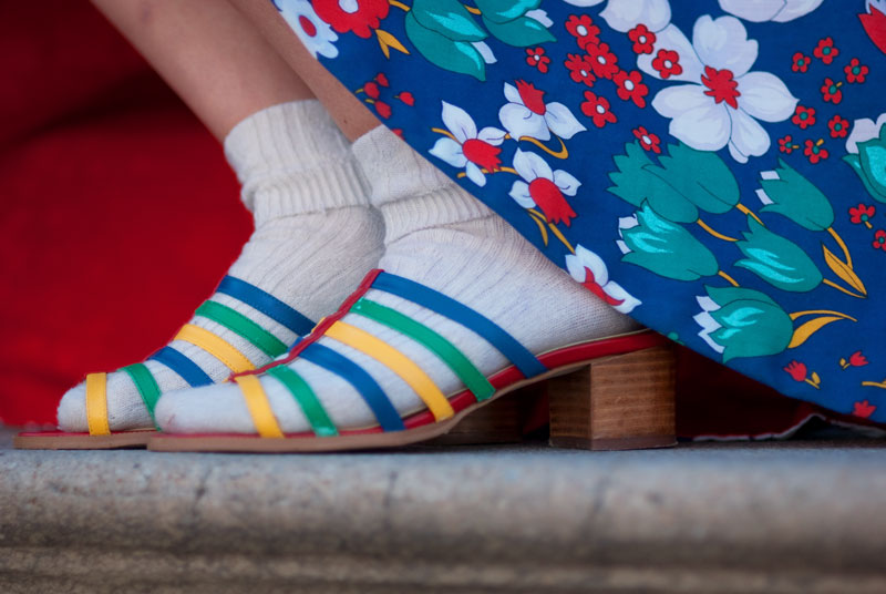
This look is special because the colors in the skirt are exactly mirrored in my shoes. Also, I frocking love 70s vintage and high-necked blouses.
Both of these looks include print-mixing. Prints are great, because you can pull the color palette out of the colors in the print, like I did with my skirt. However, mixing bold solid colors creates a cleaner, more modern look.
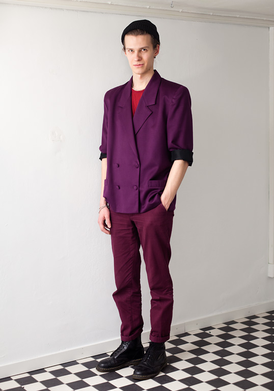
This gent on Hel Looks (street style from Helsinki) commits to plum and merlot. Complimentary Colors: red, black
Alexandra Golovanoff commits to green, glorious green – photo found here. Complimentary colors: light blue, dark blue, white and taupe. More of Alexandra, French journalist and TV host, here and here.

This lady commits all the way down to her dog. Mad respect.

It is a real master who takes on color and print like it ain’t no thang. Ye gads, his coat lining makes me swoon.
Make a commitment to tomorrow’s colors today (More photos of our outfits after the jump.)
Comments
